While table views provide a clear and simple way to navigate certain types of content, mobile should be about putting content and user goals first and navigation second. Don't overload the user with navigation choices, show meaningful content instead. Even though tab bars are great – sitting below the content, out of the way until the user needs them – there are new opportunities to explore content-centric contextual navigation when designing for mobile.
Create Better Table Views with Teasers
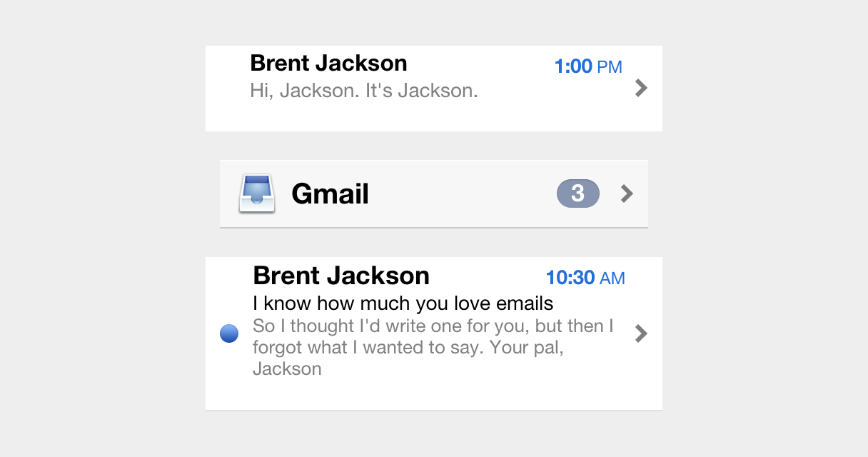
A quick and dirty way to give table views more meaning is by using teasers. Apple's Mail App shows a numerical indicator of unread emails at the top level, then shows truncated previews of actual messages at the inbox level. Similarly, Messages shows previews of the last message sent before the user drills into the conversation.
Flipping the Teaser Approach on Its Head
While teasers can make basic table views more meaningful, they prioritize navigation over content. Taking the teaser approach and flipping it on its head can result in a content-centric design that provides meaningful contextual navigation to the user. Many apps and e-commerce sites already do this, and it can help create focus on content discovery rather than search.
What are Buckets & Jumpoffs?
You've probably seen this pattern before: take a collection of items, group them into categories, present a limited number of those items in buckets or lists, and provide a link to jump off and view more. There doesn't seem to be a great name for this pattern, some have suggested calling it the egg carton or the showcase, but neither of those terms seem to capture the essence of the jumpoff link's contextual navigation – thus, buckets & jumpoffs.
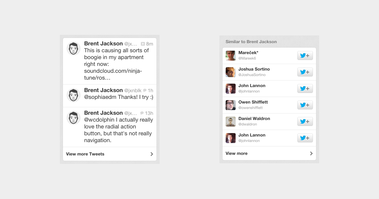
Twitter uses this approach in its profile view, along with a mix of standard table views. Instead of seeing all of the user's tweets in the profile view, there is a small bucket showing the latest three tweets and a link to view more.
Rdio does this to great effect in its search results view, showing results bucketed by artists, albums, songs, playlists, and people. This view provides direct links to the top results and a link to view more results in each bucket as well.
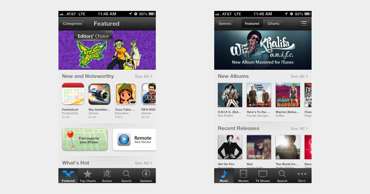
Using a mixture of swipeable carousel buckets and tiles, Apple creates a lot of visual interest in its App Store and iTunes apps. These Featured views are frequently updated and serve as a great way to promote content discovery in an otherwise extremely complex IA. Apple also uses buckets on its desktop version of iTunes, showing that this pattern can be effectively scaled up to larger displays.
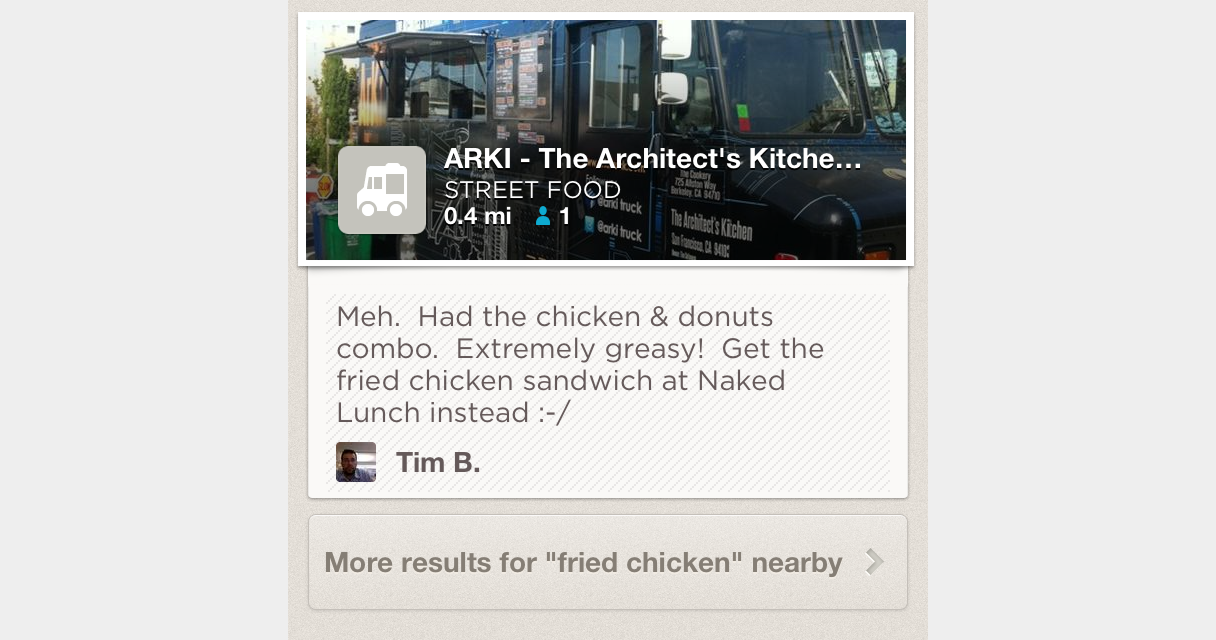
Similarly, Foursquare places contextual navigation – which is often delegated to detail views – in-line with its content-rich list view. Unfortunately, Foursquare's desktop site lacks the same level of content discovery afforded in its mobile app and, instead, relies heavily on traditional search.
Focus on Content but Don't Neglect Navigation
Mobile is a new medium, and its constraints and advantages should be taken into account when designing navigation systems. The limited screen real estate makes traditional faceted filtering and search patterns more difficult. Instead of replicating desktop navigation-heavy approaches, try content-centric contextual navigation. To create a cohesive cross-platform experience, you can translate mobile navigation patterns to desktop. This often leads to simple, focused interfaces that will delight your users.
When designing for mobile, focus on content, but don't neglect navigation in the process.