"Good design makes a product understandable" – Dieter Rams
Good navigation should do at least three things well: (1) it should allow the user to navigate; (2) it should serve as wayfinding, letting the user know where they are; and (3) it should help the user understand what the product is capable of. If your navigation is not doing these three things, something's wrong.
For the iPhone, Apple conjured up three fairly solid navigation patterns: the tab bar, the table view (e.g. Messages & Mail), and the card stack (e.g. Weather). All three work fairly well if used as intended, but there's always room for experimentation and evolution in UI design – and always room for designers and developers to screw it up.
Path and Facebook's mobile left nav flyout pattern is one such experimentation that should be avoided. Mark Kawano calls it the "hamburger icon that slides open the basement." Why call it the basement? Because it's hidden, dark, there's a ton of crap in it, and, frankly, it's scary and no one wants to go down there. Hiding the navigation allows Path to present itself in a more immersive, content-centric way but also tells the user that there's nothing much else to the app beyond its stream view.
In Facebook's case, the basement just obscures a lot of the functionality available on the desktop version. The News Feed is important & Facebook provides a lot of contextual navigation, but Facebook's got a lot of other hidden cracks and crevices that aren't readily apparent from its iPhone app. But who knows? Maybe Facebook doesn't care about Messages, Places, or Events.
Another, more obvious downside to the left nav flyout is its inefficiency: tap a hard-to-reach button, wait for an animation, scroll a list while scanning for the item you want, tap again, and wait for another animation. Your user doesn't have time for that – don't subject them to such nonsense.
Having a lot of functionality and complexity in your product is no excuse. If your navigation has more than five items at the top-level, that's just lazy information architecture. Too many choices is bad anywhere, especially on a 4-inch display.
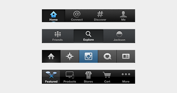
Contrast this with Twitter's iPhone app. Holding the app in hand, the user knows exactly what it is. It's small enough to wrap their brain around, and it feels easy to use. The persistent tab bar quickly describes what the user can do, where they can go, and what type of content they'll see. It also – like any persistent navigation pattern – provides context about where the user has navigated and provides an easy one-tap path to the main parts of the app.
Foursquare is another example of great mobile navigation, no doubt benefiting from its mobile-first approach. Foursquare is a much more complex product now than when it first launched, but they've maintained a simple IA that organizes functionality and content in a way that makes this complexity manageable for the user.
Instagram, arguably, could have employed a left nav flyout for a more immersive feel, but instead employs a tab bar that emphasizes content consumption, exploration, content-creation, notifications, and user profiles. This not only makes navigating the app quicker, it also tells the user what they should do with the app.
Or take the Apple Store app as an example. The desktop counterpart has a fair amount of navigation items, following patterns set by other e-commerce products, but Apple restructured the top-level navigation of their mobile app around discovery, search, and transactions.
If you have a complex product and a large number of top-level navigation items, consider taking a mobile-first approach and restructuring your IA differently from its desktop version. Maybe a goal-based architecture makes sense – for example, search vs. discovery – or maybe there are broader categories that your functionality and content can more neatly fit into. Just like truncating text is not a content strategy, throwing an entire desktop IA into the basement of a mobile app is not good information architecture.
Is the left nav flyout always a bad navigation pattern? It depends, but I haven't seen an example yet where it works well. Feel free to discuss this with me on Twitter @jxnblk.