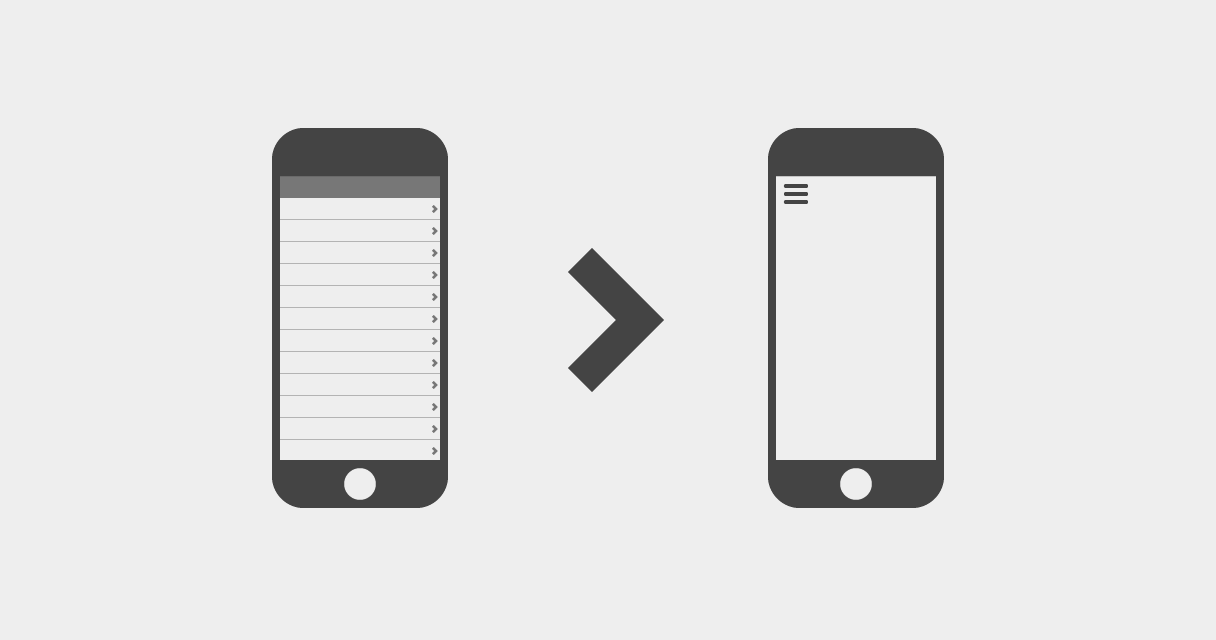
At first glance, these two navigation patterns seem very similar, but there are a few points that give table views* a huge leg up. When dealing with a multi-tiered hierarchy or a variable amount of navigation items – such as text messages, emails, folksonomic categories, folders, files, etc. – table views can be a great solution. Lists are generally easier to scan than tiles, and vertical scrolling is an easy interaction for touchscreen mobile devices.
Some advantages of table views:

- Users are likely familiar with this pattern, since it's widely used across iOS.
- With table views, the user sees the top level, bird's-eye view of the hierarchy without requiring any interaction.
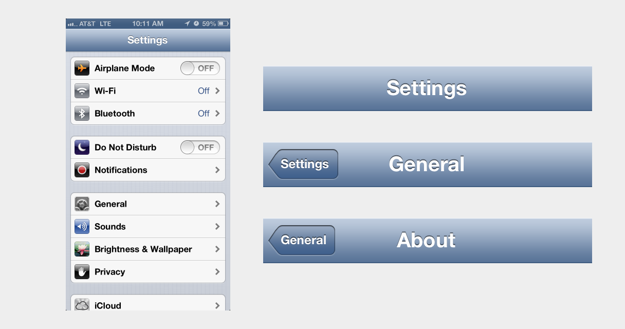
- As the user drills farther down the hierarchy, the navigation bar continues to look and work the same way, creating continuity in the UI.
- The navigation bar, along with properly labeled back buttons, works as a myopic breadcrumb, showing the user's current location and giving context to what the next level up in the hierarchy is. A hamburger button gives no context.

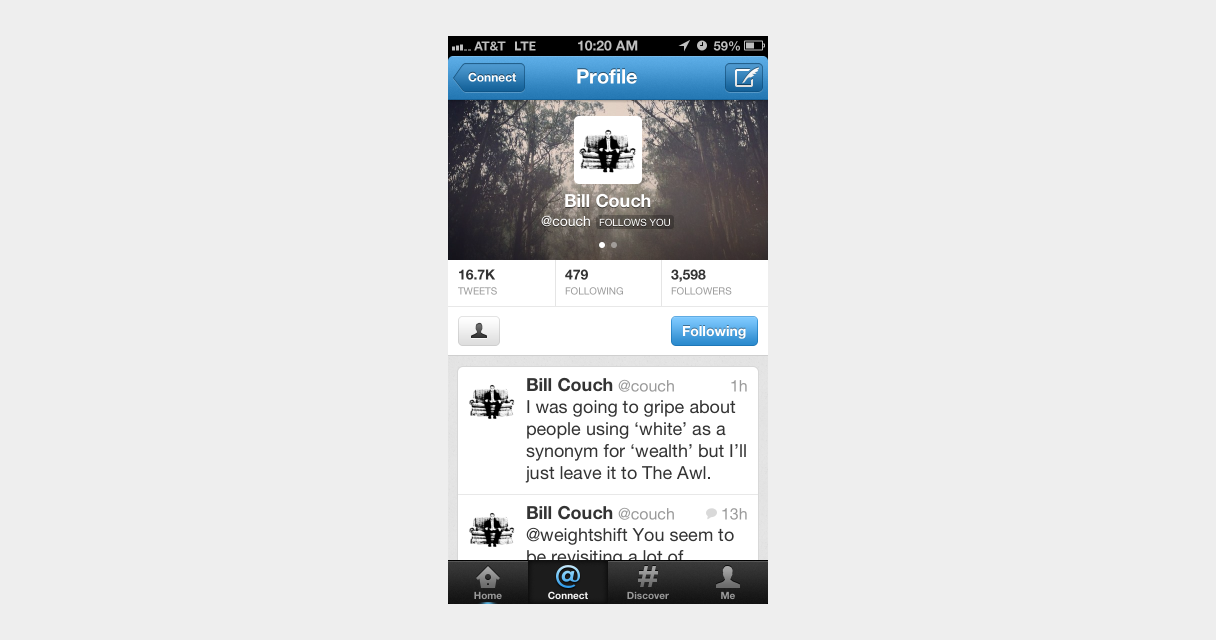
- This pattern can work seamlessly with contextual navigation. Twitter's profile view is a perfect example of this.
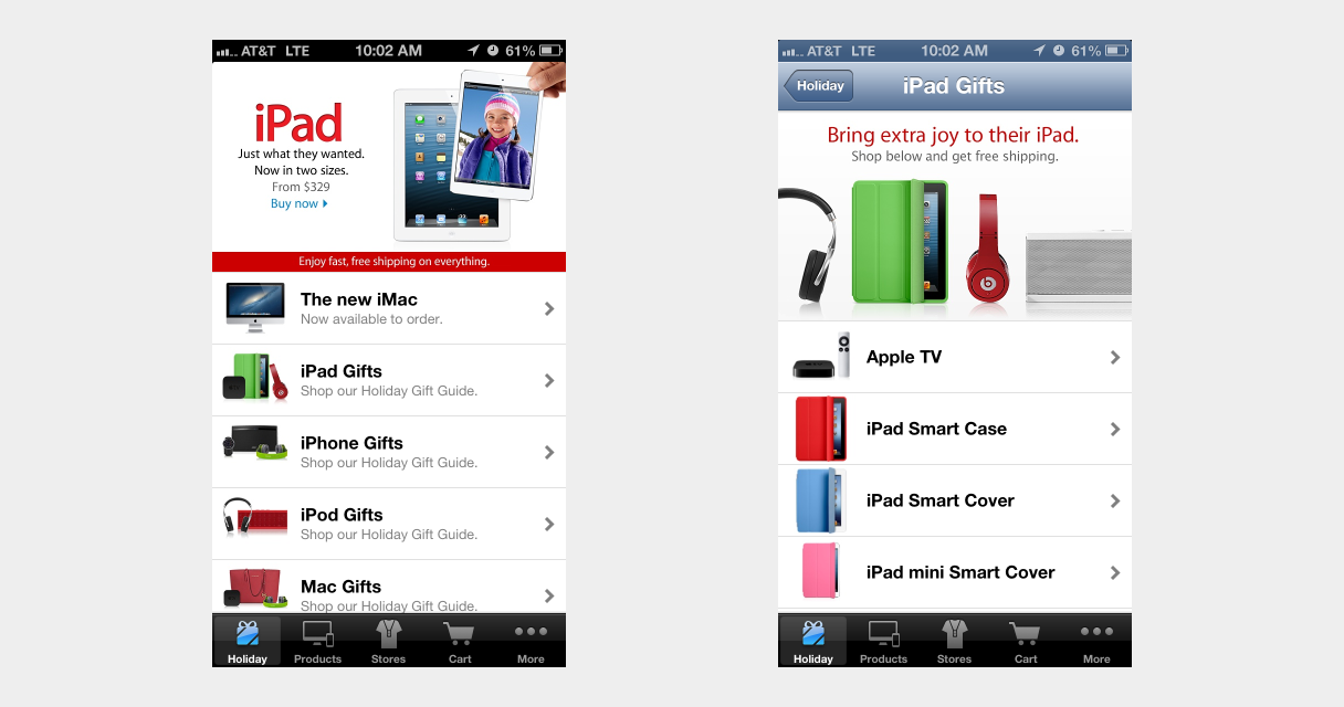
- Table views can be effectively combined with tab bars, bringing the advantages of persistent navigation to a complex IA.
- The back button is in a hard-to-reach location, but when combined with a tab bar, the tab bar button can act as an easy-to-reach shortcut to the top-level.
What can be learned from left nav flyouts
One advantage that the left nav flyout pattern generally has over table views is the swipe-to-reveal gesture shortcut. For table views, this gesture could be used as a shortcut for the back button – much like Loren Brichter's original Twitter for iPad – and navigation is probably a more common action than deleting items with the swipe-to-delete gesture.

Some may argue that the modal nature of left nav flyouts is well-suited for use as filtering controls for large collections. But, to use the Apple Store app as an example again, table views can be a very efficient way to filter through large collections of information.
Forget the flyout – use table views
If your product has a complex IA that can't neatly fit into a tab bar, consider the advantages that table views can provide before jumping on the left nav flyout bandwagon.
*Note: For lack of a better term, table views refers to the one-window drilldown pattern that combines lists and navigation bars and is widely used in iOS.
