When opening an application, a user should be able to understand its functionality, see relevant content, and get to where they want to go. Applications that obscure navigation with the intent of focusing on content can make finding specific information difficult. On the other hand, skewing towards too much navigation can overwhelm the user. Mobile apps should balance navigation for users with different information needs.
An application's IA should be based on solid user research and mental models, but navigation should take the user context and design constraints of the platform into consideration. With desktop apps, the ample screen real estate allows for high information density and complex top-level navigation. Mobile apps require different approaches to map navigation to the product's IA. One approach is to organize navigation based on three common information seeking behaviors: known-item seeking, exploratory seeking, and discovery.
What is Known-item Seeking?
Known-item seeking is exactly what it sounds like: a user knows what they're looking for and seeks it out. For example, a person going to the market to pick up eggs is engaged in known-item seeking. Search can be a great way to accommodate this behavior. But with mobile apps, avoiding touchscreen keyboards is generally good practice since there's more room for error. Recognition is easier than recollection, and scanning a list of well-labeled categories can be a much quicker way to find information. Just be sure the labels make sense to users and are backed by research, using methods such as card sorting and tree testing.
Exploratory Seeking
Exploratory seeking is when the user has a vague idea of what they're looking for but may not know the proper words to describe it. An example of this behavior is when a person goes to the market looking for ingredients for an omelet, but isn't sure which vegetables are in season. Lists of well-labeled categories can accommodate this behavior as well.
Discovery
Discovery is when the user isn't looking for anything in particular – for instance, when a hungry person goes to the market with no idea what they'd like to eat. Discovery in mobile apps is often supported by displaying relevant content – as opposed to navigation – and is usually organized by time or social cues, such as popularity.
Examples

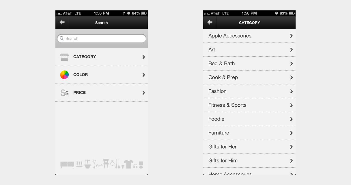
While the navigation in Fab.com's mobile app is poorly organized and not very obvious, the app still supports known-item and exploratory seeking. Its Search view has both a text field for traditional search, and a table view navigation of categories, colors, and prices.

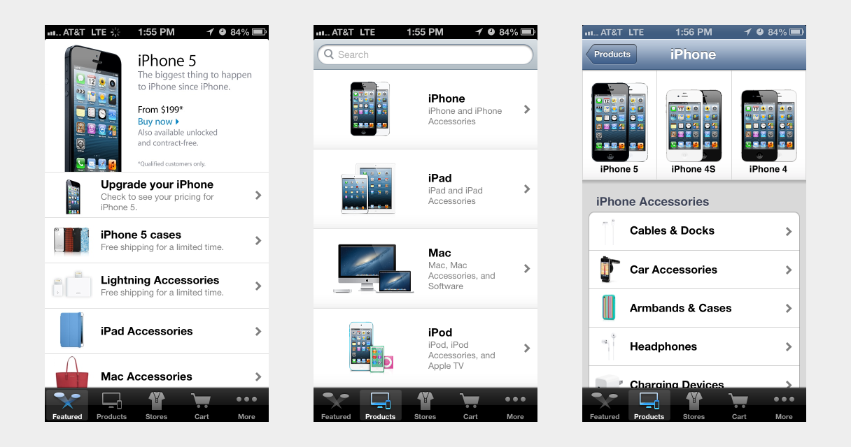
The Apple Store app's navigation includes a Featured tab, which encourages discovery, and a Products tab for seeking. A table view of well-labeled product categories provides quick known-item seeking, and both tabs include a search field at the top.

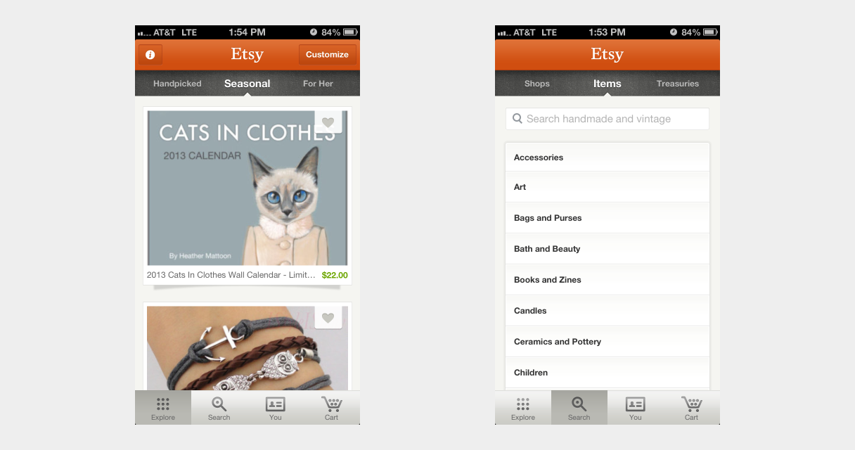
Similarly, the Etsy app supports discovery with its Explore tab and facilitates known-item and exploratory seeking with the categories listed in the Search tab. Like the desktop website, the mobile app's navigation provides obvious paths to specific items within their large inventory, but is significantly simpler at the top-level.
Rethinking Mobile Navigation
Designing mobile navigation requires different approaches than desktop apps. Don't try to cram a desktop-based navigation into a mobile app, and don't neglect navigation in the pursuit of making an app content-centric. Take a step back, look at your product's IA, and consider other organizing principles for designing mobile navigation.
